

Classic badge design
Classic Name Tag Designs: Simple Layouts That Read Well
Build a polished, consistent name badge around the information people need. Start with a simple layout, then test it with real names and clothing.
Updated November 12, 2026 · 5-minute read
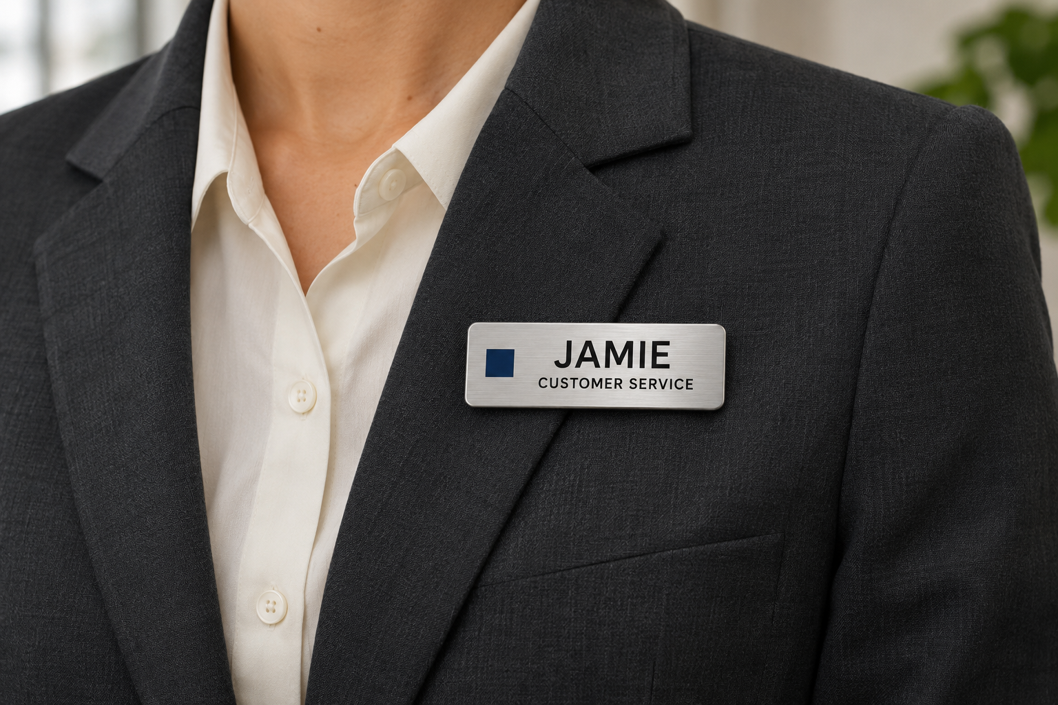
Three classic layouts to consider
Name centered, role below
This is a useful starting point when the person’s name matters most. Give the name the largest type and keep the role short. If a logo is included, make sure it does not push the name into a cramped space.
Logo left, name right
A compact logo can anchor one side of a rectangular badge while the name and role share the other. Check the longest employee name before approving the split: an oversized logo can leave too little room for text.
Small logo above, name below
This can suit a layout where the organization needs a visible brand mark. Keep the logo restrained and leave space between it and the name. If the available badge height makes everything small, choose a simpler arrangement.
Use fewer visual elements, with more purpose
A restrained palette and consistent type style help the information feel organized. Start with strong contrast between text and background. Avoid script lettering for essential information, busy patterns behind names and several competing decorative lines.
RNIB’s product design guidance provides a useful reference for presenting important information clearly. Readability still needs a real-size check on the actual design; calling a badge “classic” does not make it accessible to every reader.
Try the proof on a light shirt and a dark jacket if both are part of the uniform. The badge should stand out enough to find, while the name should stand out within the badge. Ask someone who has not seen the design to read it without prompting.
Choose a material and printing method that fit the artwork
A traditional appearance is possible in more than one material. Compare metal name tags and plastic name tags based on the specific finish, product options and work environment. Appearance alone does not establish durability, care requirements or environmental performance.
For standard engraved plastic badges, plan for single-color text and logos. If your design needs several logo colors or a photograph, review full-color formats instead. Our engraved name tag guide explains the artwork decision in more detail.
Keep one template that works for the whole team
Test short and long names, different role lengths and any accents or special characters. Decide how titles will be abbreviated, if necessary, and who approves the wording. Avoid shrinking one person’s name so much that it becomes difficult to read.
Save the approved proof and product details for later hires or replacements. A consistent template is easier to maintain when the rules are explicit: logo position, name format, role wording and permitted variations.
If assignments change often, compare reusable name badges. A reusable format can still use a classic layout; the design style and the way names are updated are separate choices.
Check the attachment and placement
A good layout loses its value if the badge turns away, hangs too low or disappears beneath a jacket. Select an appropriate attachment for the garment, wearer and activity, then check it during normal movement. Our attachment comparison covers lanyards, clips, magnets and pin-backs.
Do not add visual “security” features simply for appearance. A professional-looking badge identifies a person or role; authorization depends on the organization’s process.
Final proof checklist
- Can a new reader find the name first?
- Is the role useful and short enough to read?
- Does the longest name still fit comfortably?
- Are spelling, accents and the logo version correct?
- Is contrast clear on the selected finish?
- Does the badge stay visible on the actual uniform?
- Have product options, pricing and delivery timing been confirmed?
Classic name tag design questions
Does a classic badge have to be metal?
No. Classic describes the visual approach. A simple, consistent layout can work on metal, plastic or an appropriate reusable format.
Where should the company logo go?
Choose a position that leaves enough room for the name. Logo-left and small-logo-above layouts are useful options, but the actual logo shape and longest name should guide the decision.
Should all names be printed in capital letters?
There is no universal requirement. Use a clear, consistent style that suits the chosen font and naming policy, then test it at actual size. Do not sacrifice readability to match a decorative treatment.
How much information belongs on a name tag?
Start with the name and a useful role or department. Add other information only when it helps the reader and fits without crowding. A website address or slogan is often less useful than a larger name.
Can we keep a classic look when names change frequently?
Yes. Compare reusable window or write-on formats and keep the branding consistent around the changing name area. Confirm the selected product’s update method and care instructions.